Booking a stand at a wedding show or other exhibition is a great way to get your message across too many people. However, it is likely that the show will feature some of your competitors too. How do you make sure that your stand gets noticed?
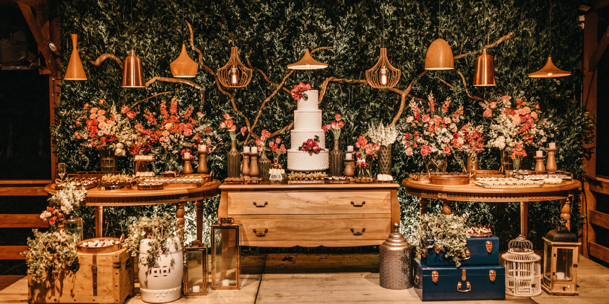
The first impression the visitor gets is a hugely important one. Your stand needs to be visually stunning. Flowers are what you do, so your flowers must be perfect, of course. They need to be centre stage and impactful. Don’t rely on your folders with pictures of different bouquets and arrangements to get your message across. You need the real thing, in different styles: bright and vivid, cute and pretty, sustainable and natural.
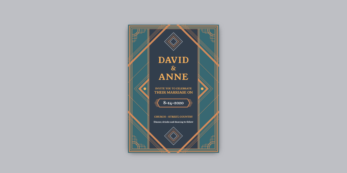
However, you will need to frame your stand to create a space that is all about you. Printed banners and pop-ups will create an instant backdrop and are low cost these days. Business cards, printed on recycled or even flower seeded paper that grows, can make a lasting impression. They can be sourced via your printer or graphic designer: use your unique business branding and imagery to set the tone.
You’ll also need somewhere to hold more detailed conversations with your potential customers once they’re engaged, so a small table and a few chairs is a good idea. Don’t go for the large rectangular tables usually offered by exhibition venues: they are too big and look impersonal. Better to have a small round folding table – a garden table, for example.
Having a beautiful stand is only the first step in winning business at a show. What you do is even more important: I’ve seen so many show stands fail because the people staffing the stand are too passive. Sitting behind a table waiting for people to approach you is never going to succeed. You need to get out there at the front or even in the aisles, with a friendly smile and an inviting opening greeting. Make eye contact with people: most will respond positively – they are there for a reason.
Your opening gambit is important. It might be the offer of a glass of fizz (but remember that many will be drivers so supply non-alcoholic alternatives) or the chance to win something they value – ten table posies or a corsage for the mother of the bride. Be relaxed and chatty with them. The last thing they want is full-on sales patter so let them talk about themselves at first. When they’re comfortable, ask them if they have thought about what their flowers should be like – and then you can draw them in to a more detailed conversation.
You’ll need to have things to give to them to take away – so handouts and perhaps freebies. Your handouts should be specific to the market you are tackling, so all about weddings for a wedding show. You may well do funeral flowers and gift bouquets but that’s not what’s on the mind of the people at the show and will dilute your message.
Handouts are important. The quality of the paper on which they are printed as well as the design and colours used will all combine to deliver a message about you and the service you provide. It doesn’t have to be a multi-page brochure but should reinforce what you are saying to them and signpost them to your other marketing channels such as your website or social media pages. Maybe think about flower/greenery crib sheets – colour groups, seasonality, home-grown or imported, etc, for them to take away and read.
Freebies don’t have to be expensive – they are just a gesture that helps to make you and your stand memorable. A single flower with your business card attached or mini cupcakes decorated with
flowers, or pads of post-it notes overprinted with your details – people love pads! Printed usable postcards, featuring your work, are a nice idea too.
Having a presence at a wedding show is expensive, of course. Not only do you have to pay for your pitch on the day, but you also need a whole range of marketing materials to create the image and messages that best promote your business. However, you should see these as an investment in your business – a necessary expense that when used


